

Essential Elements of Minimalist Design
Minimalist design is a creative approach grounded in simplicity, intention, and purpose. At its core, this design philosophy seeks to strip away the unnecessary, allowing only the essentials to remain visible and functional. Far from being bland or empty, minimalist design uses space, color, and form to communicate messages with clarity and elegance. By prioritizing essential elements and eliminating distractions, minimalist design creates environments and visuals that are both visually appealing and highly functional. The ultimate goal is to foster a sense of calm, focus, and balance, making every detail serve a meaningful purpose.
Focus on Functionality
A minimalist approach never sacrifices ease of use for style. Clarity in user experience ensures that users understand how to interact with a product or space immediately and without confusion. Information is organized logically, and navigation pathways are straightforward, reducing cognitive load. By minimizing visual clutter and streamlining content, minimalist design lets users engage with essential tasks without being overwhelmed. This clarity is not just visually pleasing; it also enables users to accomplish their goals efficiently, reinforcing the underlying principle that form follows function.
Previous
Next
Mastery of Space and Layout
Harnessing Negative Space
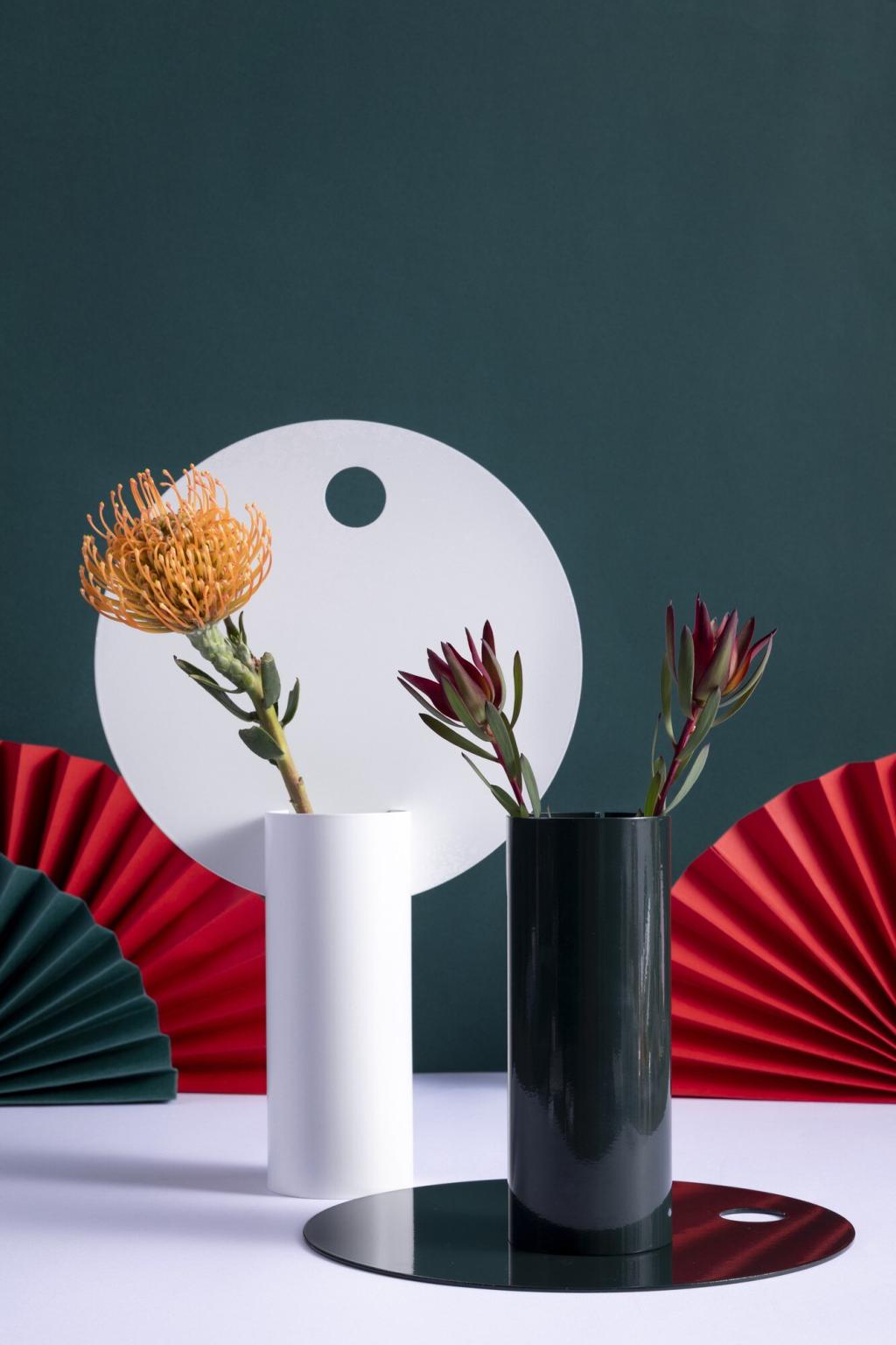
Negative space, sometimes called white space, is a defining feature of minimalist design. It’s not just empty area; it plays an active role in shaping the perception of a design. Proper use of negative space gives the eye places to rest, framing important content and making layouts feel less cluttered. By intentionally leaving areas open, designers can create emphasis on key features, improve readability, and foster a sense of sophistication and calm. Negative space thus transforms what isn’t there into an essential part of the design’s overall effect.

Balanced Composition
Composition in minimalist design is a careful act of balance between elements. This doesn’t mean symmetry is always required, but rather that every component should relate to others in a harmonious manner. Balanced composition ensures that no single element overpowers the rest, allowing the design to feel stable and well-proportioned. Through strategic placement and sizing, minimalist designers guide the viewer’s journey across a page or space, highlighting what’s important without overwhelming the senses. The result is a design that is comfortable to interact with and delivers its message with clarity.

Visual Hierarchy
Establishing a strong visual hierarchy is crucial in minimalist layouts. By using contrast, scale, and positioning, designers direct attention in a way that prioritizes key information and actions. Minimalist designs often rely on limited cues, so every choice must be deliberate: larger headings, bolder accents, or strategic pops of color can guide users efficiently. This clarity supports better comprehension, allowing viewers to quickly grasp the order of information and respond accordingly. Visual hierarchy ensures that simplicity never comes at the expense of effective communication.
Purposeful Color Selection
In minimalist design, color isn’t used for decoration alone—it conveys meaning, hierarchy, or mood. Designers often rely on a simple palette, choosing one or two dominant shades complemented by neutrals. This purposeful color selection gives the design a cohesive and refined feel, allowing important elements to stand out without visual noise. Accents are used sparingly, often reserved for calls to action or essential highlights. This careful restraint not only supports the concept of less is more but also enables color to communicate powerfully when it is deployed.
Clean and Readable Typefaces
Typography in minimalism always favors clarity and legibility over ornate or decorative choices. Clean, sans-serif typefaces are frequently selected for their modern, unobtrusive appearance, but what matters most is how the text serves the user. Consistent sizing, adequate line spacing, and clear contrast with the background all contribute to readability. By minimizing the number of fonts and styles, the design maintains a streamlined appearance, eliminating confusion and keeping attention on the content itself. Great minimalist typography feels effortless and serves as a quiet foundation for the overall experience.
Unity Through Consistency
Minimalist designs achieve unity by maintaining consistency in both color and typography throughout a project. This consistency extends to headings, body text, labels, and any colored elements, reinforcing a cohesive visual language. When color schemes and typefaces remain uniform, users can navigate the design confidently, intuitively understanding where to find important information. Consistency also prevents jarring transitions or visual clutter, making the overall experience smooth and harmonious. In the context of minimalism, consistency is the silent force that underpins all aspects of visual communication.
Previous slide
Next slide